
eShopping + AI = the next eCom revolution
- a Case Study
Timeline
4 weeks
Type of project
Mobile App
My Role
Solo Designer
(Personal project)
A design journey to find ways to assist online shoppers that is analogous to the kind offered by
sales assistants in physical stores.
Take a quick look at the concept here!
Understanding the problem
Traditional online shopping lacks personalised assistance and guidance that shoppers receive in physical stores, leading to frustration, decision fatigue, and reduced conversion rates. Shoppers struggle to navigate vast product catalogs, make informed choices, and find items that truly match their preferences, resulting in missed opportunities for sales and an unsatisfactory shopping experience.
For shoppers with busy schedules, this becomes even more frustrating and some reject the idea of online shopping entirely.
I have personally witnessed users experience this problem and resort to shopping in-store (especially the older generation, those who have limited time to shop and those with easy access to physical stores).


How might we provide assistance to online shopper that is comparable to the kind they would find in physical stores?
Who is this for?
- Frequent online shoppers of both pleasure and utilitarian products.
- Busy shoppers who wish to outsource the “chore” of shopping or hate having to sort through multiple websites, or options.
- An occasional shopper was also onboarded for the interview to understand the wider shopper behaviour.
Scope - how far are we going with this?
I’ve had the opportunity of consulting 8 users in the research process for this project consisting of participants from India, USA, Australia and New Zealand. They were recruited through a survey.
My Role
This was a personal project done as a part of my bootcamp with Mento Design Academy. This project was started from scratch without any existing product to build-on. I had the opportunity to go through each stage from research to iteration, and understand the significance of each stage in the design process and every phase helped me get closer towards a solution for the problem.
My process - a quick overview
My work began with conducting user interviews. From the data gathered, I began understanding the primary areas where assistance is needed in online shopping.
I then conducted secondary research to find evidence that could support the findings from my generative research.
Next, I began to brainstorm ideas, letting the research data directly inform possible solutions. After selecting the most applicable ideas and further defining them through user stories and scenarios, I defined a UX strategy that led to designing wireframes and a prototype, which were tested with users who found it to be an effective solution.
Overaching Insight
The kind and level of assistance required depends on the type of product (high stakes or low stakes), the kind of shopping (pleasure or utility) and the time available to shop.
Journey to solution
Research for what?
- I wanted to know shopper experience with assistance both online and general.
- I wanted to know how online shoppers search for and pick products.
- I also wanted to know how they navigate and filter through the many options/variety.
- And finally, I wanted to uncover how people with busy schedules, manage their shopping.
User Interviews
I onboarded a total of 8 participants and throughly interviewed them about their online shopping habits and experiences. I also inquired about their general shopping habits and their experience with any kind of in-store assistance (as the general idea of assistance overlaps).
Key Discoveries
Validated Assumption
The kind and level of assistance required depends on the type of product (high stakes or low stakes), the kind of shopping (pleasure or utility) and the time available to shop.
Hypothesis
Invalidated
Paradox of choice is not always a problem. Users said it was sometimes fun to randomly browse (especially when they had lot of time.) This is akin to how some shoppers like to simply browse stores,
without any focused intention.

Themes identified and focused on

🤔 Some users don’t take assistance as they sometimes feel asking for help means admiting defeat - same reason why some men don’t ask for directions.
😎 Having lots of time - some users don’t mind spending time randomly browsing.
⚠️ Shopping is largely emotional and is subject to mood swings. The same user who would ask a salesman a hundred questions before purchasing that new television, may not do so the next time around, or they may spend hours self-researching before taking any asistance.
Ideation
After defining the problem, I began the process of ideation to find feasible solutions. At each step I directly took inspiration from the data gathered from interviews. First I went wide by brainstorming as many ideas as possible, working out of a Miro board. After the obvious ones were noted, I began venturing into some unique ideas.
Basic skeleton of the shortlisted idea
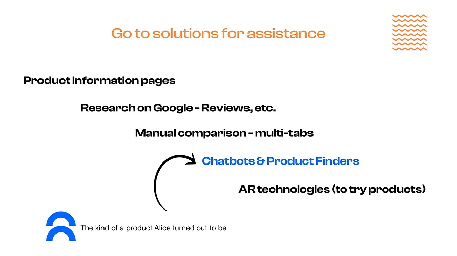
I decided to implement an industry popular solution - Chatbot and Guided-Shopping Product Finder. I wanted to combine the power of AI with these models to create an optimal assistance solution.
Though both Chatbot and Product Finders have limitations, I decided to ideate for where they went wrong and find work around solutions. Infact, I asked users in interviews about their experiences with Chatbots and all of them had a unsatisfactory experience with them.
Limited to 1 or 2 step fitering - Users expressed that chatbots ask them what they are looking for and then show them a products list page straight away, instead of helping them fitler down further. “Letting go of their hand halfway.”
Limited technology - Some users said chatbots struggle to understand their language (natural way of speaking)
Cookie cutter answers - One user said that repeated cookie cutter answers are a turn off for using chatbots.e.
Implementation - Converging
When I began converging, I picked out the feasible and applicable ideas and filtered out the rest. The ones I went with are as follows:


Building the Solution
Low-fidelity Designs


Concept testing
Though both Chatbot and Product Finders have limitations, I decided to ideate for where they went wrong and find work around solutions. Infact, I asked users in interviews about their experiences with Chatbots and all of them had a unsatisfactory experience with them.


High-Fidelity Designs
Next, I began creating the high-fidelity designs implementing changes to address the issues that came up in concept testing. It was a many stepped process and I started by putting together a design system to create a consistent design and to have reusalbe elements and components to speed up the workflow.
Take a look at the design system used in this page.
I created Alice as mobile app, adhering to Google’s Material Design principles in each step. I tried to design the features as close to existing mental models, as can be seen in popular eCommerce Apps like Amazon and chatbots on many eComm Websites. However, without an exact example of this kind of a solution, some newer looking sections had to be improvised and I tested them with users in the usability tests.


Outcomes & Results
In the usability tests, users were able to effectively and efficiently do the tasks. In the follow-up questions of each task, almost all expressly stated that Alice would be very helpful in assisting their online shopping.
Usability testing - What worked
Effectiveness
All the users who took part in the usability test successfully completed the tasks. They felt that the solution was an effective way to shop, that would save them lots of time.
Efficiency
Except 1 participant all the rest finished the tasks very quickly. 2 of them verbally stated that it was way quicker than their usual way of online shopping.
SUS test
Users verbally answered a SUS (System usability scale) test. The results were neutral to positive. Here are the results.
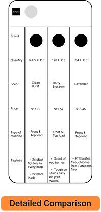
The Compare products was the most liked as the users expressed. Gratefully, all the other three features were also equally well received, except some confusion with little details.

Iteration
I created Alice as mobile app, adhering to Google’s Material Design principles in each step. I tried to design the features as close to existing mental models, as can be seen in popular eCommerce Apps like Amazon and chatbots on many eComm Websites. However, without an exact example of this kind of a solution, some newer looking sections had to be improvised and I tested them with users in the usability tests.
Usability testing - What worked
1. The Let’s Chat (Chatbot icon) was understood as the primary feature, but it’s position in the home screen wasn’t clearly presenting the hierarchy of importance.
I decided to add a textfield in the upper section of the screen as well. As the user starts viewing the screen from top left, this will be the first thing they would see.
2. Confusion with the meaning of a catalogueI
I’ve decided to use a quick overlay screen to explain it, similar to the overlays explaining the heart and the cross
3. Lack of few labels in the saved shopping lists to indicate system status clearly.
Required labels were added wherever there was a confusion for the users.
Conclusion
This journey of finding assistive solutions for online shopping, was a very exciting experience. Initially I had no idea such an upcoming market of AI powered chatbots existed (I thought they were only for customer support). I simply started with the problem of “lack of sales assistance in online shopping as compared to traditional shopping.”
After speaking with users, I understood the types of assistance that users seek and decided to focus on the most problematic of them.
With a thorough ideation processes and consulting the users multiple times, I arrived at ‘Alice’ an AI powered e-shopping assistant, that proved to be an effective solution both observationally from user’s interaction with it, and from the System-usability-scale questionaire. Some users also verbally stated that the app would save them a lot of time.
Next Steps
An opinion that came up in post usability-test questions with 2 users, was that they would still like to indulge in e-window shopping and that Alice felt too focused on narrowing down choice. This could be a further feature to be implemented into Alice.
Also, the complete evaluation of the app will be possible through long term studies like diary studies and viewing user data. If developed, I would undertake some quantitative research.
All things considered, I believe if developed ‘Alice’ would be a very useful shopping assistant. This journey has thought me a lot about the process of UX design, which I believe will add to my career experience.
Thank you for giving it a read!
Any feedback would be appreciated.
Nikhil Cheerla