
A redesign that slashes operational costs by 30-50%
Timeline
Nov - Dec 2025
The Brief
Mobile App
- Audit & Redesign
Client
Monitra Health
My Role
UX Design
Consultant
(6 member team)
Monitra Health’s global expansion was crippled by "high-touch" manual dependencies.
From device activation to returns, the business model relied on heavy human intervention!
Here's how I helped them pivot to Empowered DIY— removing the middleman to make the system scale.
Want a quick overview instead? Here's me explaining the whole project in under 2 mins.
The stakes
Why this mattered to me
In 2024, my family experienced the sudden weight of a heart stroke when my aunt fell ill. During her recovery, her doctor prescribed an ambulatory cardiac monitor—a small, simple patch designed to detect irregularities and prevent future episodes. I saw firsthand how a piece of technology could offer a family peace of mind.
Little did I know that a year later, I would be working to help Monitra Health scale that very same impact.
The Business Objective
Monitra’s UpBeat device is already a success in India, helping doctors at 500+ hospital chains save lives. However, their next chapter is more ambitious: 10x growth.
To expand into North American and European markets, the product needed to move beyond its "high-touch" roots. My task was to audit the experience and design the path toward international readiness.

Monitra's Website featuring the patch sensor and screenshots of it's current patient app.
The Problem: The "High-Touch" Bottleneck
Monitra Health’s success in India was built on a foundation of intensive manual support. While this white-glove service worked locally, it created a critical scalability issue for international expansion.
The Legacy Workflow (India):
Physical Dispatch: A trained field agent personally visits the patient at home.
Manual Setup: The agent applies the sensor, pairs it with the phone, and provides a live tutorial.
Human Validation: A backend manager must stay on a call to confirm data transmission.
Ongoing support: Support agents calls the patient in case of any disconnections or queries during the monitoring period.
The Real-World Conflict
This model is logistically impossible in markets like the United States! You cannot send a field agent to a farmhouse in Nebraska (for instance) without destroying your margins. To compete globally, we had to eliminate the need for the support agent.
The Hard Truth: Global scale demands a fully self-serviceable DIY experience—something the legacy app was never built to handle.
The Solution: Building DIY Confidence
If a field expert couldn’t be in the room, the app had to become the expert. We focused on turning an anxious medical procedure into a guided, intuitive experience :
Onboarding & Setup: From Information to Action
The legacy app bombarded users with technical data from screen 1. In the real world, an anxious patient doesn't want a lecture; they want to know, "Am I doing this right?"
The Problem
Technical Overload: verbose paragraphs explained "how it works" while the user was still trying to figure out how to log in.


The Problem

Skippable disclaimer: Users skipped vital disclaimer because it was presented as a wall of text and with an active skip button.
My Solution
Calming introduction: Reassuring anxious patients that this is going to be easy.


Simple welcome: Quick scannable info of what upBeat is.
My Solution

Acknowledgement: Users cannot proceed without marking the acknowledgement check box.
Setup Solution
Apply-it-yourself: In the absence of a field agent to guide patients, we introduced a highly visual step-by-step guide with clear instructions, to help the patients apply the patch to their chest, which is the first DIY win.
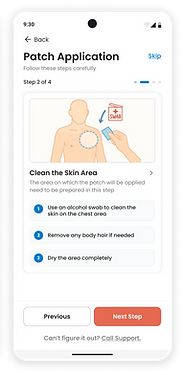
"Simply put, I spent several iterations refining the copy to ensure it sounded encouraging, not clinical. It wasn't just
about reducing text—it was about finding the right words to replace a human field agent."
The Connection: Sensor to phone, phone to cloud
In the legacy model, this is entirely done by the Field agent, who even has to call a backend manager to verify that the signal is being received. To scale, I had to translate that hands-on help & verbal confirmation into a "visual system status."
The Design Audit: Engineering Trust
Without a human expert in the room, the app had to provide immediate, undeniable feedback. We designed the connection flow to address the following primary anxieties of a solo patient:
"Is it connecting properly?" – Clear Connection Status indicator shows the data "moving" from sensor, to the phone and to the cloud. The cloud sync status which takes time, moves to the background as the user moves on to "Learn more". This way they don't have to wait around.

"What do I do while it syncs to cloud?" – While syncing occurs in the background, patients can see videos about the sensor's day to day usage. This replaces the field agent’s verbal counselling, ensuring they feel confident about their routine without needing a support call.
"Is it receiving my heartbeat signals?" – Introduced a Live ECG Signal preview. Seeing their own heartbeat in real-time provides more reassurance than any "Success" checkmark ever could.
In a multi-sensor environment :
"Which one is my sensor?" – Solved the problem of recognising the right sensor by introducing a unique ID concept (6 digit) with the alternative of scanning a QR code on the sensor for auto-connect.

Safety and Data Integrity : The Clinical Pivot
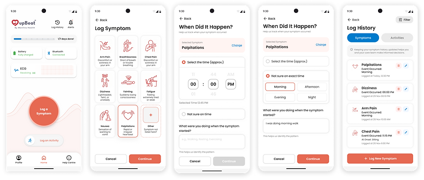
The third and perhaps most critical UX fix was Symptom Logging. We discovered a major data integrity flaw in the old app. The legacy app only captured the time of submission, not the time of the event. If a patient fainted at 2:00 PM but logged it at 4:00 PM, doctors were left searching through hours of irrelevant data to find the heartbeat of crisis.
The Redesign: Retroactive Accuracy
I redesigned the flow to prioritize clinical precision while accounting for the reality of a high-stress medical moment.
-
Retroactive Logging: Patients can now easily include the time of an event in the symptom logs, ensuring the doctor sees the exact heartbeat that caused the symptom.
-
Cognitive Ease: Added "Parts of Day" presets (Morning, Afternoon, Night) to help patients in case they don't remember the exact time.
-
Operational Impact: By automating accurate timestamps, we eliminated the need for medical staff to manually hunt for data, further reducing the operational burden.
The Result: This wasn't just a UI update; it was a clinical safety fix that replaced manual searching with automated precision.
Closing the Loop: Automated Logistics
Beyond clinical features, I spearheaded the automation of the entire business ecosystem. Previously, the "Back Office"—ordering, payments, and device tracking—happened through hundreds of manual phone calls. I integrated this entire lifecycle into the app to remove the administrative burden.
The Business Pivot: From Paper to Product

-
The Digital Storefront: I designed an integrated ordering and payment flow, allowing patients to select their monitoring period and pay deposits securely without needing a sales agent.
-
Real-World Tracking: Using Heuristic #1 (Visibility of System Status), I added an 'Order Status' tracker. Much like a delivery app, this provides patients with peace of mind and eliminates the "Where is my device?" support calls.
-
Automated Returns: I simplified the return process—a primary source of lost inventory—by creating a clear, app-guided return flow.
Impact & Reflection
By transitioning Monitra Health from an Assisted to a Self-Service model, we didn't just redesign an app; we re-engineered the company's unit economics.
The Business Results
Operational Savings: Enabled a projected 30-50% reduction in activation costs by eliminating the need for field agents and manual support calls.
Global Readiness: Cleared the primary operational bottleneck, paving the way for expansion into the North American and European markets.
Clinical Safety: Replaced manual timestamp searching with automated retroactive accuracy, ensuring faster and more precise diagnoses for doctors.
Summary of Ai Usage
This project followed a completely Ai augmented design process, where we trained Gen Ai and Ai tools with templates, ample context and examples before using them to assist us on product audit, ideating workflows and also the final designing of the wireframes. It has enabled us to finish this consultation in only 3 and half weeks.
Personal Reflection
This project was a lesson in the power of Empowered DIY. My goal was to create a digital companion that felt as reliable as a human expert. By respecting the patient's anxiety and the doctor's time, we built a system that scales without losing its heart.
"I am grateful for the opportunity to have worked on a solution that balances business survival with human care.
It proved to me that the best design isn't just seen—it's felt in the efficiency of the business and the peace of mind of the user."