
Balancing transparency & human safety to
increase donor trust by 55%!
Timeline
8 week Sprint - phase 1
Aug 2024
Type of project
Website
Client
WeHelp&Care
through
TechFleet
My Role
UX Design
Co-Lead
How do you prove a non-profit’s impact when showing the truth could put lives at risk?
I co-led a team to design a 'safe transparency' model for an NGO operating in a conflict zone.

Hi-fidelity wireframes - in this phase the design team's final deliverable was a hi-fidelity prototype,
complete with UX copy and images.
The Conflict: A Balancing Act in a War Zone
We Help and Care (WHC) operates on the front lines of the civil war in Myanmar, delivering food and medicine where it is needed most. However, their digital presence was caught in a paradox: to attract donors, they needed to show their work; but showing too much of their work risked exposing their staff to a military junta.

Why the "System" Was Failing
-
The Gap: Donors stopped giving because they couldn't see the impact.
-
The Threat: Showing faces or precise locations in Myanmar leads to military targeting.
-
The Mission: Audit the information hierarchy to find a "Safe Language of Impact."
WHC's old website - outdated design language, issues with UX copy and lack of clear CTAs.
My Role: Co-Leading the Ethical Pivot
As a UX Design Co-Lead, I didn't just manage a team of six; I acted as the guardian of our ethical North Star. My responsibility was to ensure that every design decision balanced the donor’s need for transparency with the field worker’s absolute need for safety.
Key Contributions:
-
Strategic Facilitation: Bridged the gap between Security Protocols and User Desires during an intensive 8-week TechFleet sprint.
-
Information Architecture Audit: Redesigned the data hierarchy to prove impact through anonymized, verifiable metrics.
-
Servant Leadership: Co-led a cross-functional crew of 4 teams (PM, Strategy, Research, Design) to ensure a unified narrative.
The Trust Audit
Heuristic #2 Violation
The "System" (website) was completely disconnected
from the "Real World" (the NGO's actual mission).
Key Findings from Audit

Ineffective
Visuals
Images used on the website are not personal to the mission of WHC.

Insufficient
Information
UX copy isn't current or doesn't provide enough info to build donor trust and encourage them to initiate a donation.

No clear
CTA
Pages lack clear Call-to-actions (CTA) to prompt donors to take specific action.

Poor donation
UX
The donation process isn't wired to international audiences, lacking key features like credit card donations.
"During the audit, I realized we weren't just missing data; we were missing humanity. The website looked like a template, while the real-world work was raw, brave, and deeply personal. My goal was to close that gap."
Recommended steps to solution from Audit
Rewrite
UX Copy
Provide sufficient info to promote trustability and transparency - especially about the current situation in Myanmar and disclose details about the WHC's activities. (as much as possible without compromising security)
Visual
Redesign
Punctuate info. with effective imagery, infographics and other visual aids. Use evocative imagery specific to the cause of WHC.
Simplify
Donations
Donation process needs to be completely re-designed with clear CTAs, flexibility with donation frequency, control over donation cause and use of an internationally relevant donation gateway.
How is everyone else doing it?
Next, the design team was tasked to put together a Competitive analysis report. We decided to take a look at some successful NGOs and their websites, primarily taking a look at approach to UX and their visual design, especially with regards to their Navigation, CTAs, Donation process, UX copy and Branding. Take a look at the full presentation here.
Key takeaways

Example from www.lightacandle.global
Encourage
Donation
Conversions
Info like 'breakdown of donation' doesn't give away sensitive info but builds towards improved trust. We need to tell the user WHO the organisation is and WHY they should donate.

Example from www.feedingamerica.org
Increased Branding, UI & Visual Design
There is a need for a brand guide and stronger branding. The site as whole needs to be harmonious visually. There is a need for stronger photography.

Example from www.map.org.uk
Better UX copy &
Language
Approach
Pages lack clear call-to-actions (CTA) to prompt donors to take specific action.
"I and my team spent a week analyzing over 15 humanitarian platforms. It wasn't about copying their features, but about understanding where their 'Real World' constraints differed from ours. This research was the
foundation of our ethical framework."
Building a solution
Low-fidelity Wireframes

A general breakdown of donation usage without revealing information that could effect security .
(mobile version here)
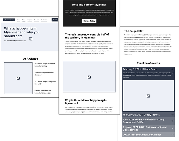
Page to explain the crisis - history and current news articles links.
Helps Donors understand the sensitivity of the situation.
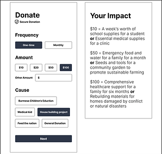
Re-imagined Donation process with maximum flexibility (no pressure donations)
- builds trust
Rewriting the UX copy - Builds trust through authenticity, professionalism and specificity
WHC used a generic tone of voice for headings as well as body content. There was also a major UX error wherein, they were trying to reach to audiences of three different language groups at once. There was also no specific to-the-point information that donors typically look for. All of this had to be revamped so we changed the UX copy in the entire website.
Protecting privacy - the solution (in mid-high fidelity)

By blurring out parts of the photos like staff's faces, we can ensure their safety but at the same time give donors an assurance that WHC is run by real people who are facing real threats.
We avoided mentioning any specific
details of places names or upcoming
events in the website, to ensure
safety.

Design System

Challenges: Refining the Scope for Impact
In an 8-week sprint, the greatest challenge isn't the workload—it's maintaining the quality of the solution under pressure. During Phase 1, we faced two critical "Real World" constraints that required a strategic pivot.
1. The Design System Audit
Initially, we adopted a full Material UI library. However, we quickly realized it was over-engineered for our needs, leading to
a cluttered workflow.
-
The Decision: I led the team to strip back and curate a bespoke Design System. We only kept components that served our unique "Safe Transparency" goals, ensuring the final handoff was lean and usable.
2. Quality Over Speed
By Week 7, we realized that pushing for "High-Fidelity everything" would compromise the rigor of our usability testing.
-
The Decision: We pivoted to a polished Mid-Fidelity Prototype for the final deliverable. This allowed us to focus on the integrity of the Information Architecture—ensuring the donor journey was solid before layering on visual aesthetics.

The Legacy of Phase 1
While our goal was a full high-fidelity launch, the real-world complexity of an 8-week sprint required a disciplined pivot. We chose to deliver a rigorous mid-fidelity foundation over a rushed final coat of paint, ensuring every ethical and security requirement was battle-tested.
The Outcome
-
Projected Impact: A semi-transparent community interface designed to increase donor trust by 55%.
-
Operational Readiness: Delivered a comprehensive Design System and Research transition kit (Interview Guides, Screener Surveys) to empower the Phase 2 team.
-
The Ethical Blueprint: Established a "Safe Transparency" framework that allows NGOs in conflict zones to prove impact without compromising worker safety.
A note on the journey
In late 2024, We Help and Care was forced to go offline due to escalating difficulties within Myanmar. While the website's journey ended prematurely, the design solutions we built remain a testament to the power of ethical UX.
"This project wasn't just about building a website; it was about building a shield. My time as Co-Lead taught me that a designer's greatest tool isn't their software—it's their ability to navigate ambiguity with empathy. I am proud that our team provided WHC with a voice during their most silent hour."